Slider
Sliders provide a visual indication of adjustable content, where the user can increase or decrease the value by moving the handle along a horizontal track.
Overview
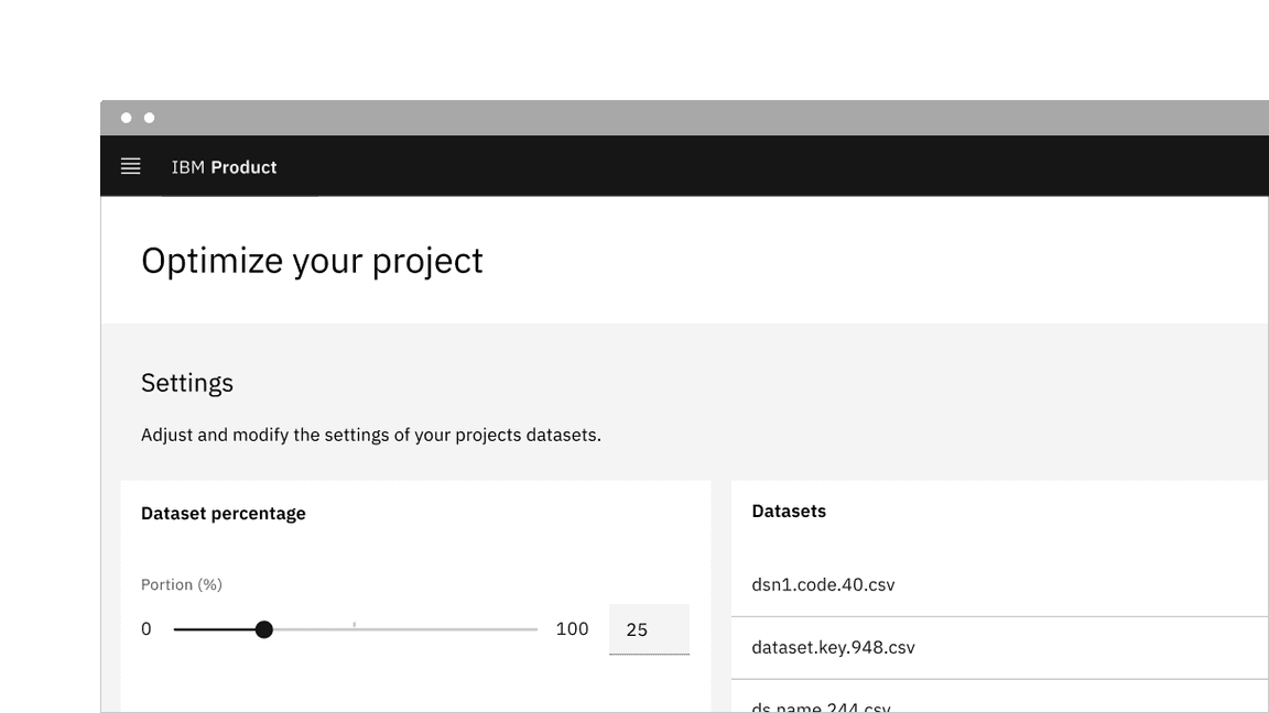
The slider in its basic form should be accompanied by a label and a number input that doubles as a display for the slider’s current value.
The basic slider does not include discrete values, as the slider represents a percentage of 0-100. In this case it is not necessary for a user to choose a specific value, but instead generally increase or decrease an input. For example, the user increases the slider amount and the volume of the music gets louder.
The more complex versions should be used for selecting a specific value within a value range.

Live demo
This live demo contains only a preview of functionality and styles available for this component. View the full demo on Storybook for additional information such as its version, controls, and API documentation.
Behaviors
States
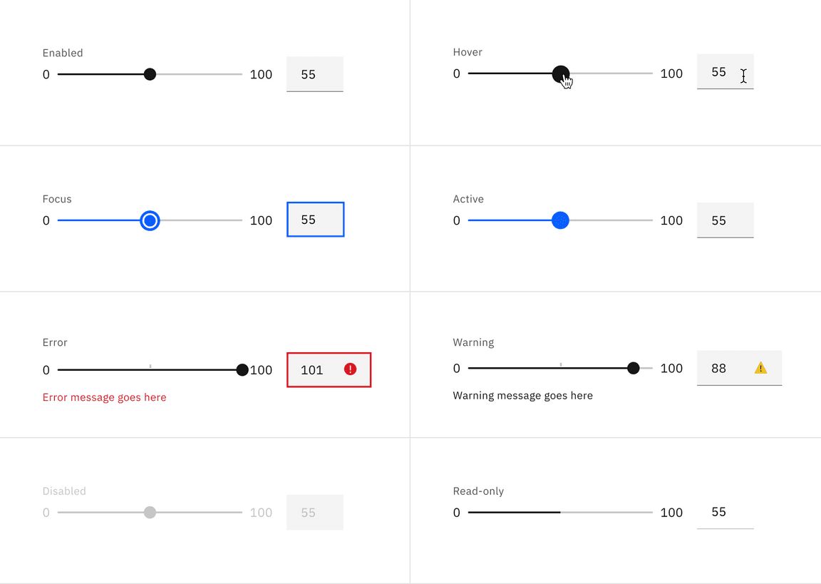
The slider component has the following states for both the track and the text input: enabled, hover, focus, active, error, warning, disabled, read-only, and skeleton.

Interactions
Mouse
Users can trigger a value change by clicking anywhere on the horizontal track. Users can also drag the slider handle. Either method repositions the slider and automatically updates the value in the text input.
Keyboard
Users can enter an exact numeric value into the text input field or use the
up, down, left, and right arrow keys to change the value. Either method
adjusts the slider handle to the corresponding position.
Users can also increment the value by using the arrow keys when the slider
receives focus. The arrow keys, in combination with the shift key can alter
the slider by the value of the stepMultiplier.
Best practices
- The slider label should indicate what value the slider is changing.
- Range values are used to describe the range in numbers.
- Do not use for extremely large ranges, for example, 1-1000.
- Do not use ranges that are too small, for example, 1-3.
Feedback
Help us improve this component by providing feedback, asking questions, and leaving any other comments on GitHub.